Context
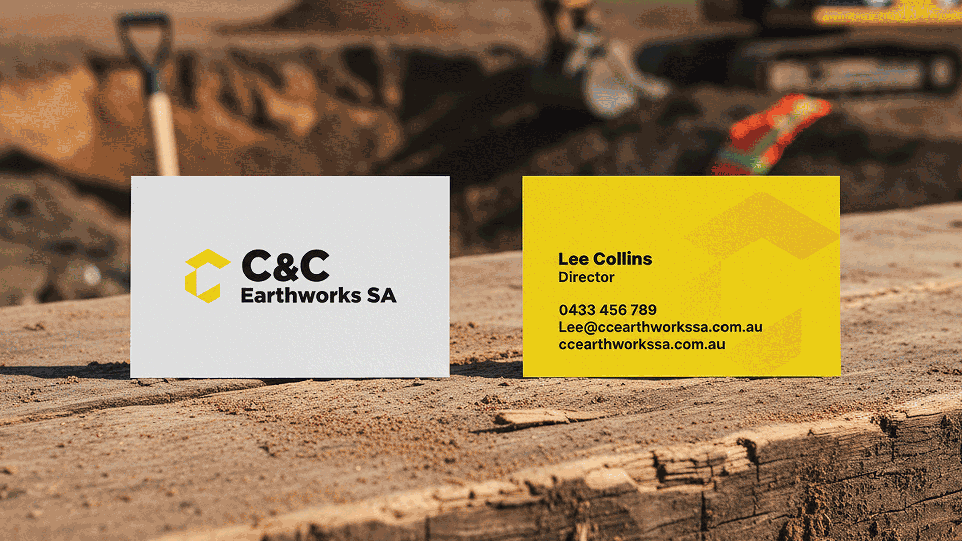
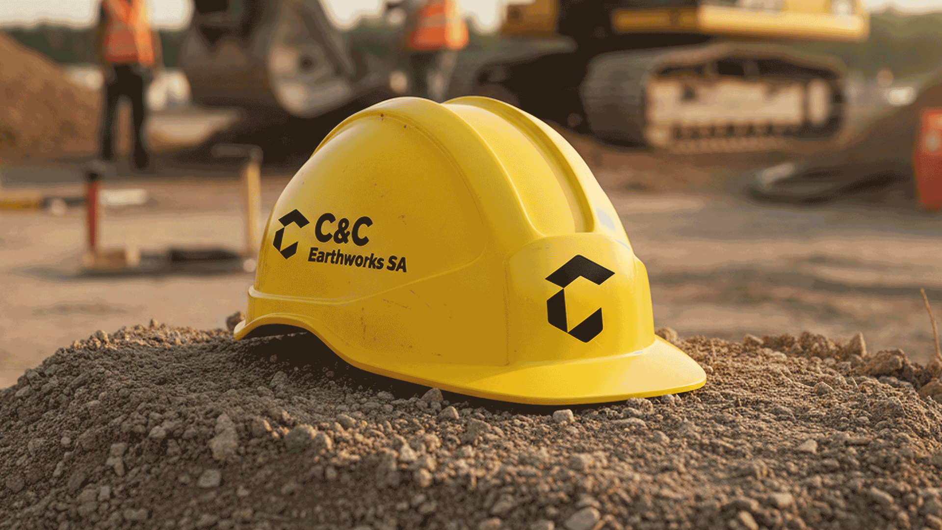
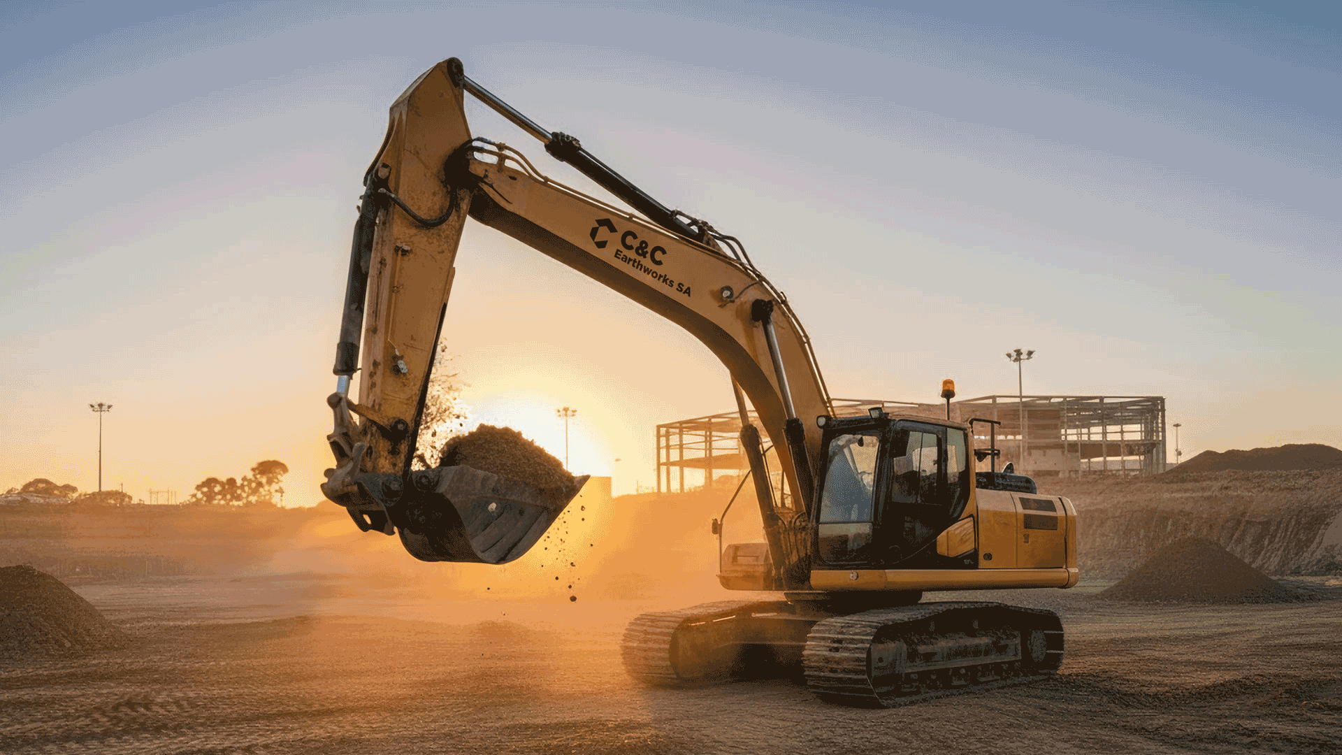
C&C Earthworks SA is a South-Australian civil earthworks business built on 20 years of industry experience. In 2025, I was engaged to design a professional and contemporary brand that reflects the business values of reliability, precision and adaptability. The requirements for the logo were to incorporate a visual of an excavator and the colour yellow.
Approach
The logomark is comprised of three segments: the arm, the boom and the bucket in a geometric form that conveys industry, strength and precision. The logomark is paired with a bold, clean sans serif font that is professional and contemporary.


Outcome
The result is a strong and bold brand identity that is both professional and timeless.