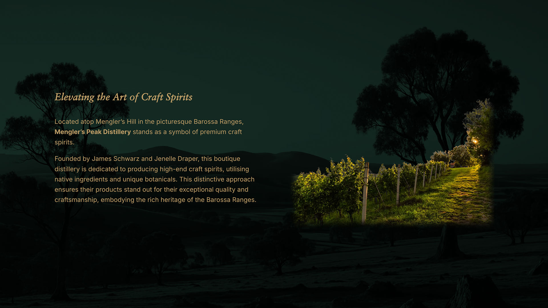
Context
Mengler's Peak Distillery is a start-up distillery located atop Mengler Hill in the picturesque Barossa Ranges. The boutique distillery is dedicated to producing high-end craft spirits, utilising native ingredients and unique botanicals. In 2024, I was engaged to develop a professional and contemporary brand which reflects their values and make them stand in the crowded market.
Branding
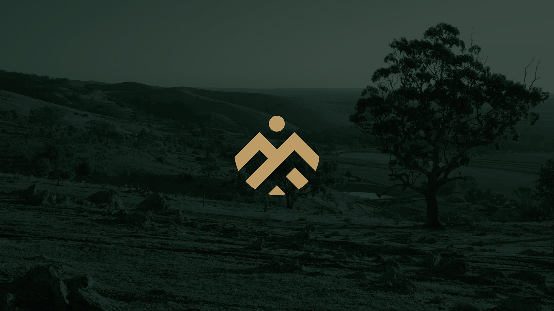
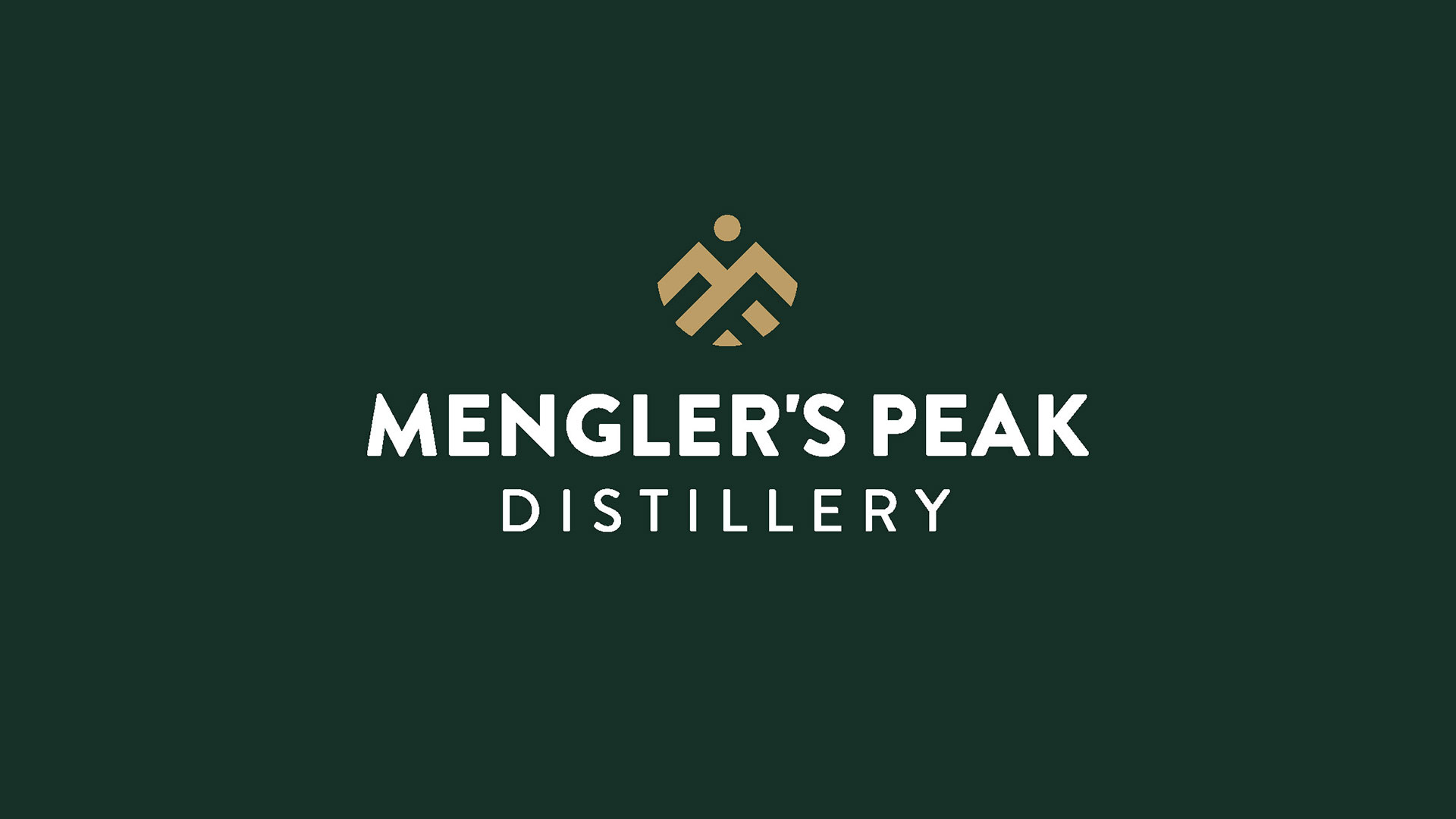
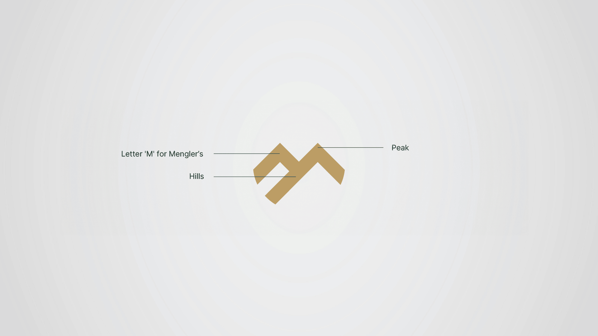
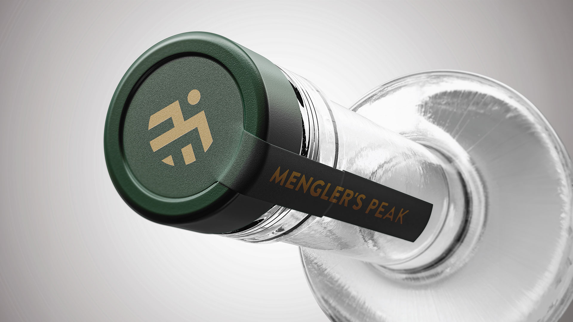
The logomark is formed from the letter “M” as two hills for Mengler, with a sun above to signify peak and new beginnings. The internal stroke lines reference vineyard rows across the Barossa, while the negative space under the right hill subtly forms a “P” on a 45 degree angle for Peak.
The gold logomark references both the region’s gold-mining history and the premium quality of the product, while the deep green reflects the use of native botanicals and the surrounding landscape.
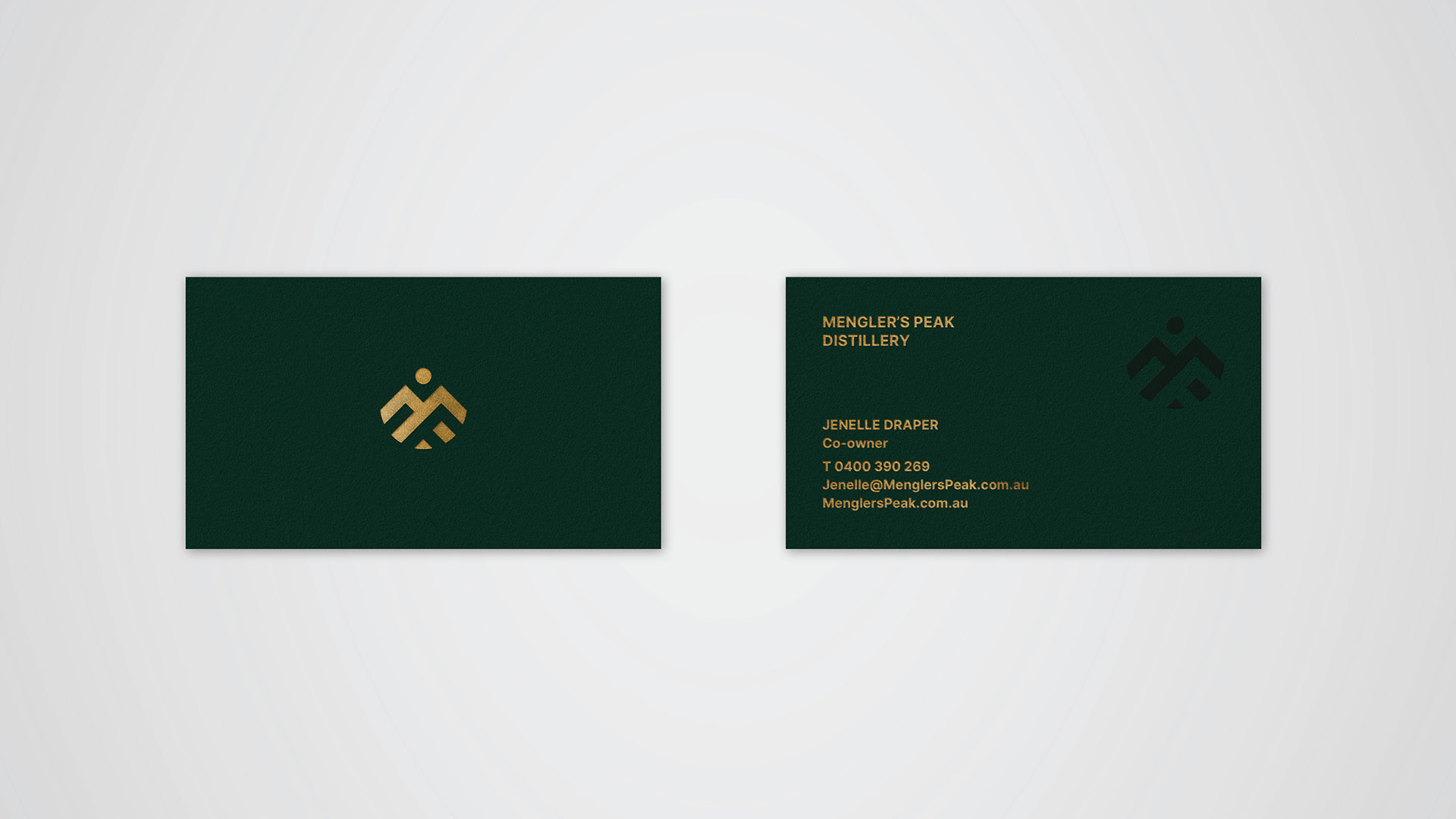
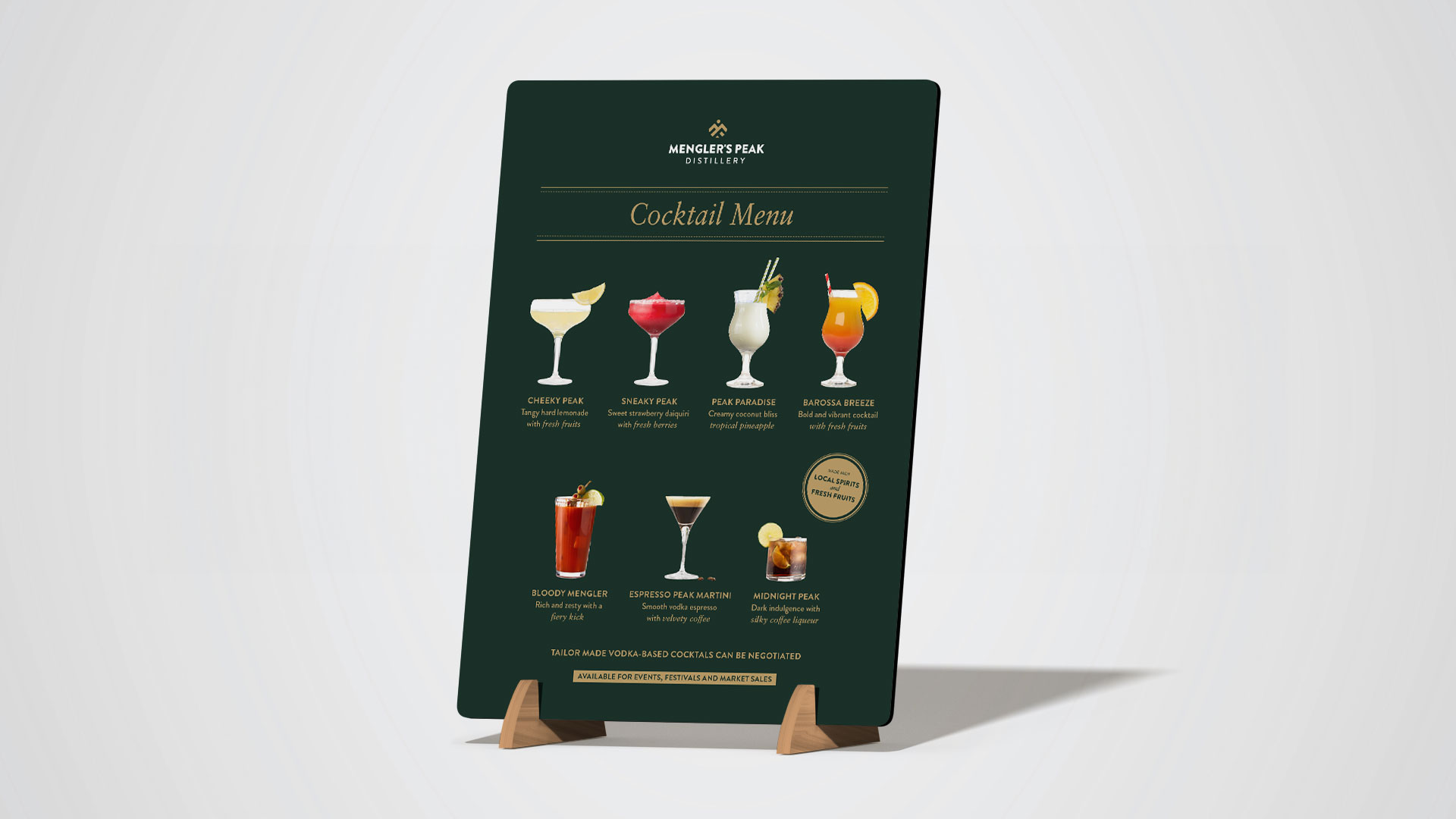
Stationery & Print
The brand was applied across business cards and a suite of cocktail menus for tastings and events, using restrained typography and colour to build a clear, consistent brand presence.
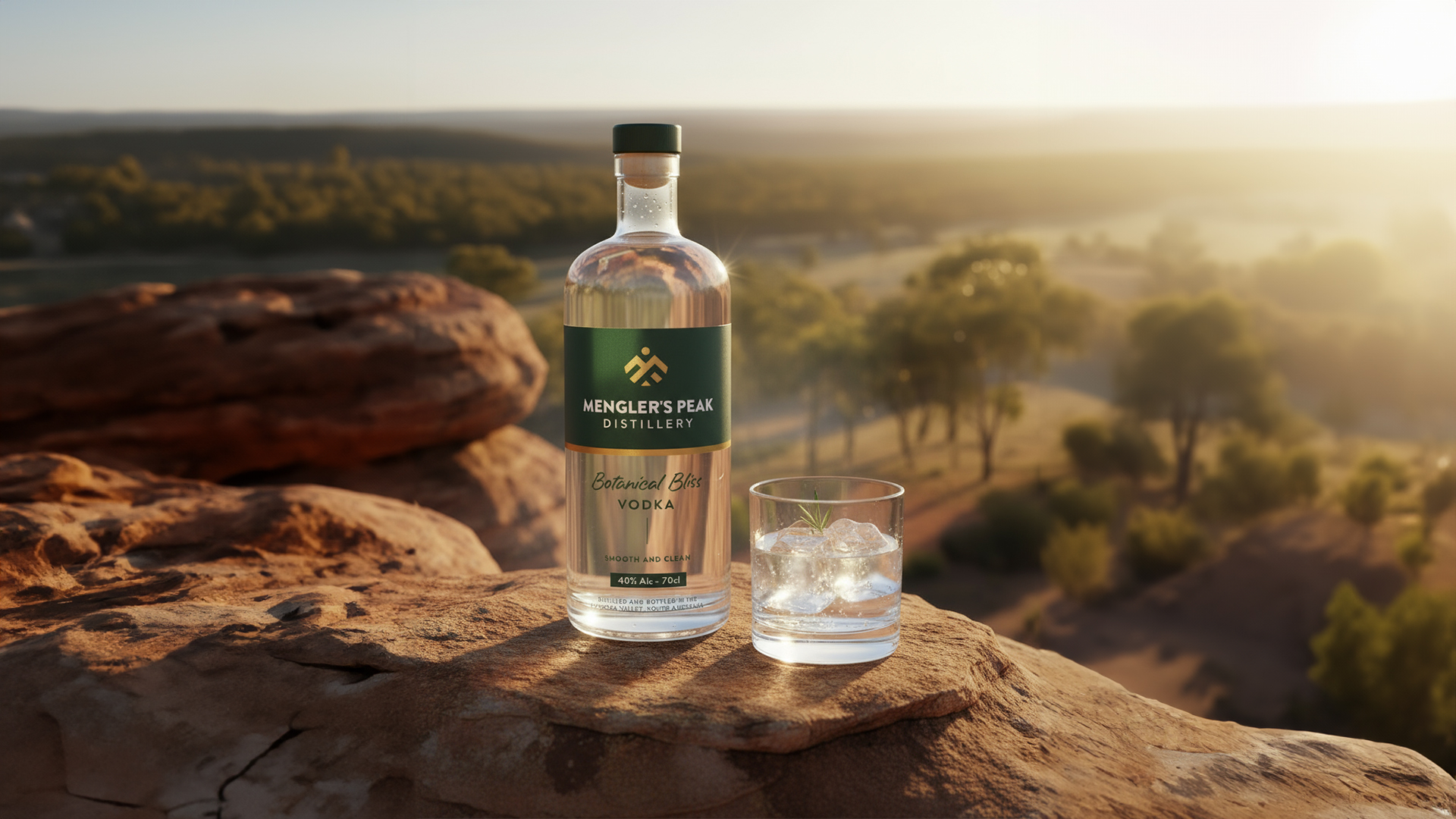
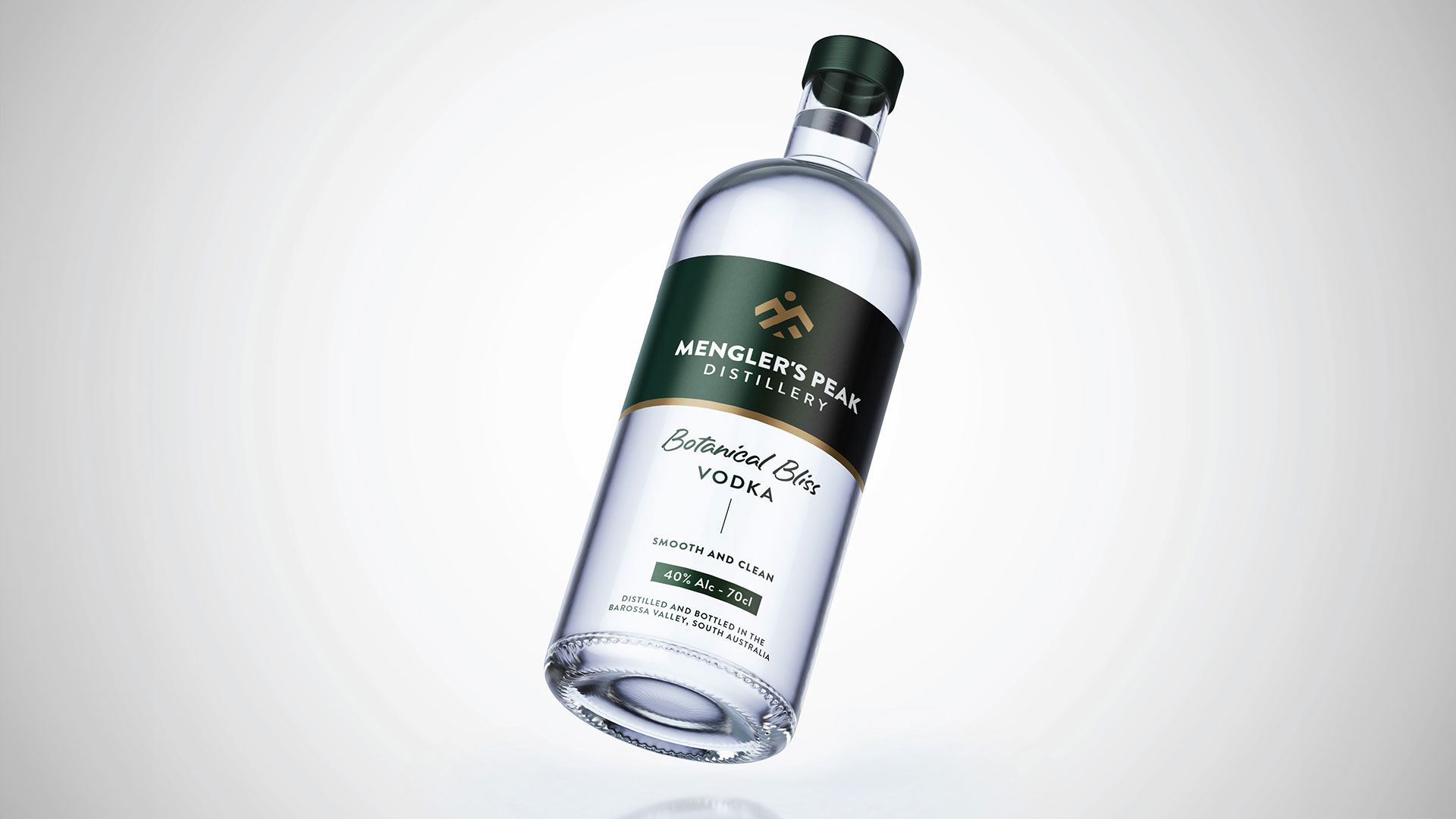
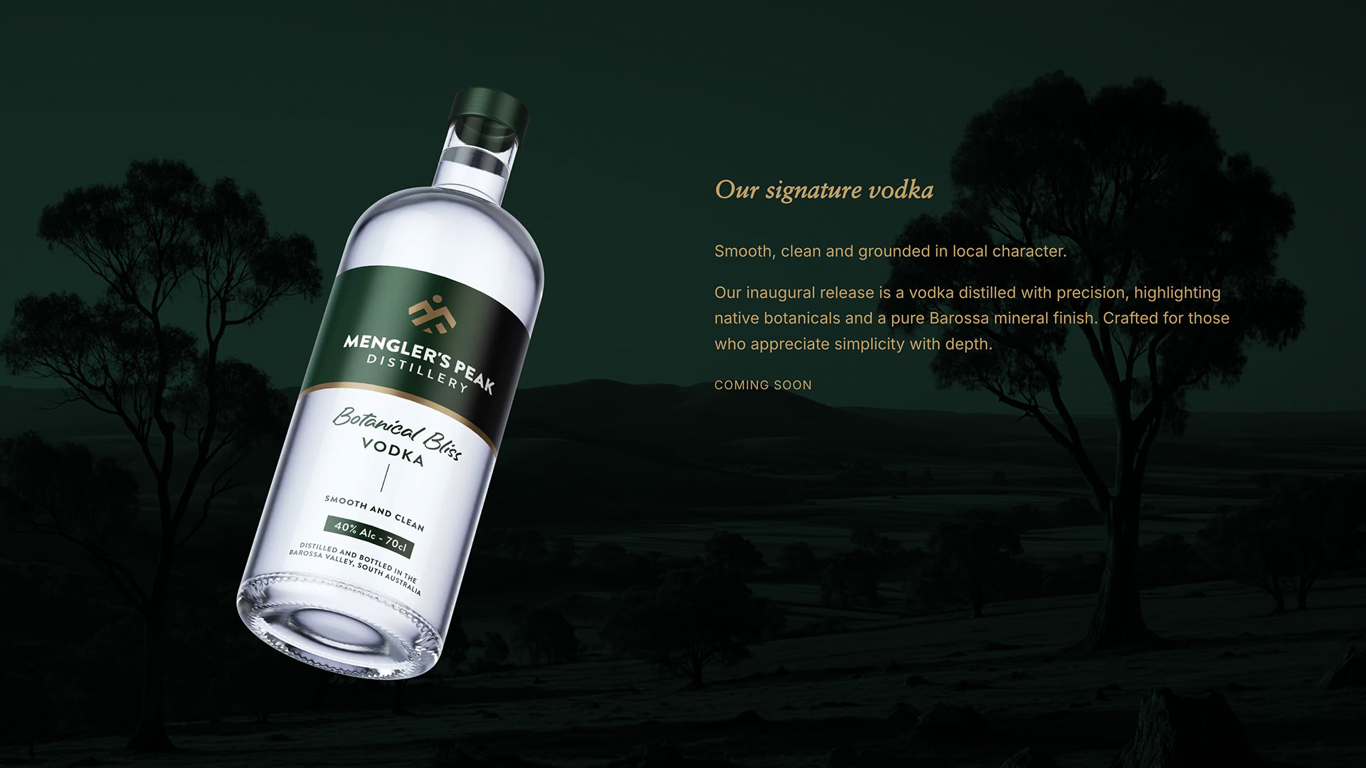
Packaging
Mengler’s inaugural vodka is clean, smooth, and proudly Barossa made. Distilled from pure wheat and produced locally in the Barossa Ranges, the packaging was designed to reflect the clarity and quality of the product. A simple, considered approach keeps the focus on purity and peak craftsmanship.
Marquee & Signage
A marquee and A-frame signage was developed to be used at events, festivals and markets. The goal was to be visible, legible from a distance, and unmistakably part of the brand family.

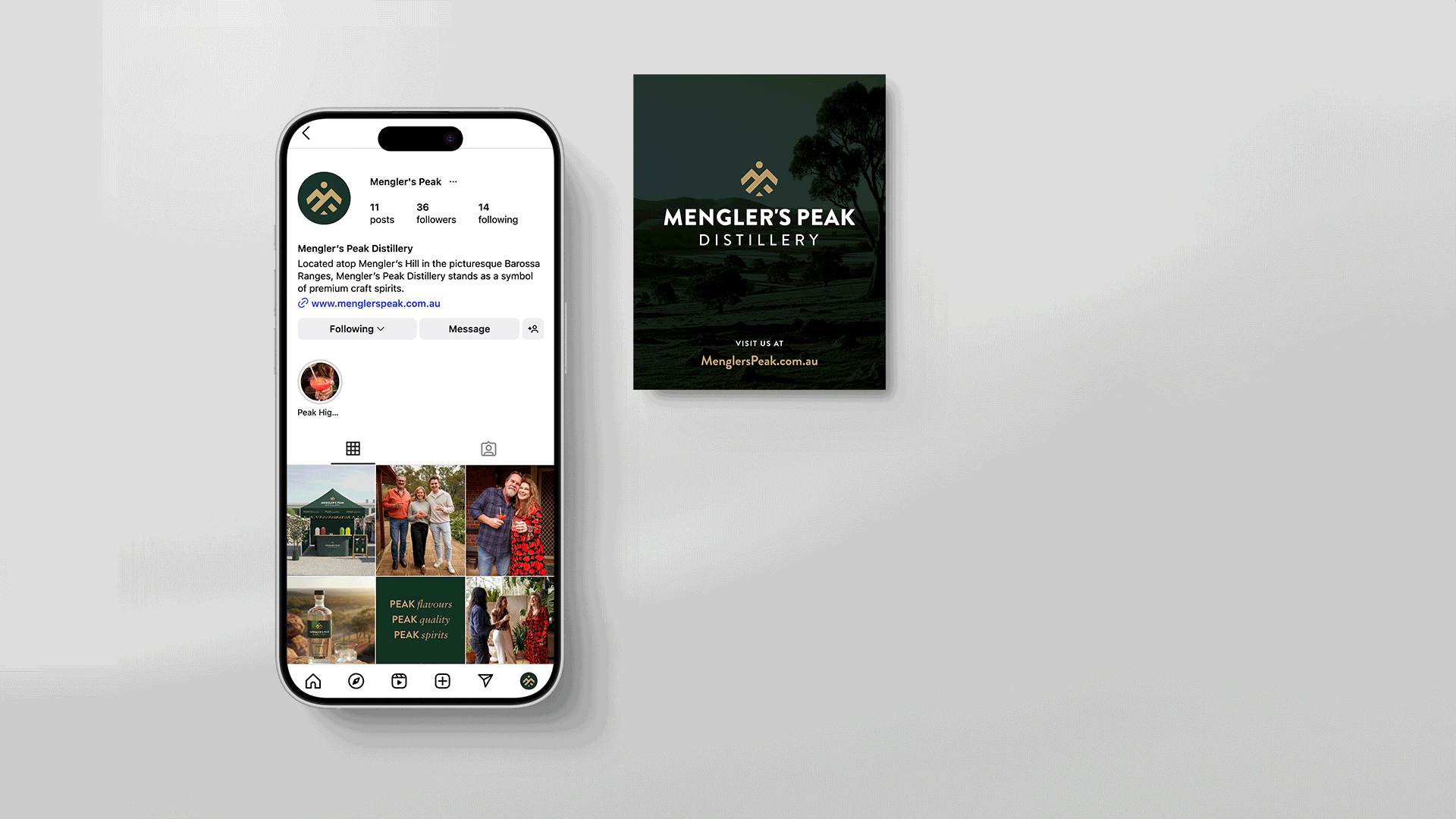
Social Media & Website
Event photography and social media assets were created to support a consistent brand presence, alongside a single-page website introducing the distillery.
Outcome
A clean and versatile brand system that reflects Mengler’s Peak Distillery’s connection to location, craft, and quality. Across all touchpoints, the identity holds a consistent voice and presence, positioning the distillery as distinct and high-end.